

6 Unique Payment Page Design Examples
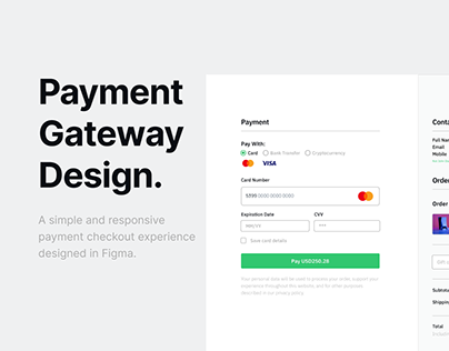
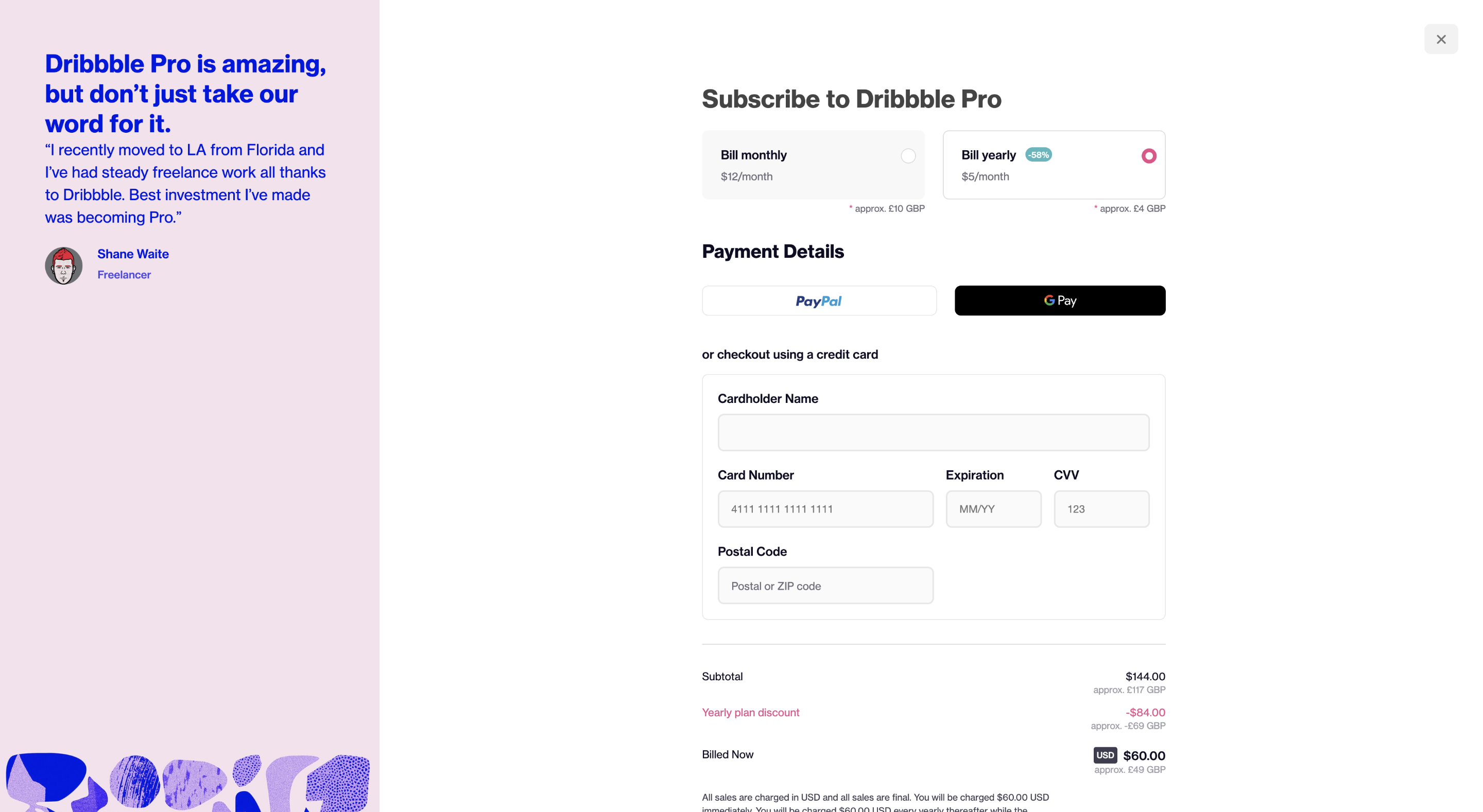
- Dribbble Biggest Takeaway: Dribbble’s payment page excels in simplicity, featuring a clean interface that makes for a smooth and intuitive user experience. The checkout design from Dribbble minimizes information fields, making it easier for customers to complete their purchase. A streamlined interface with fewer details to enter increases the likelihood of finalizing transactions. The organized format and inviting colors contribute to a pleasant and efficient checkout process, encouraging customers to complete their purchases.
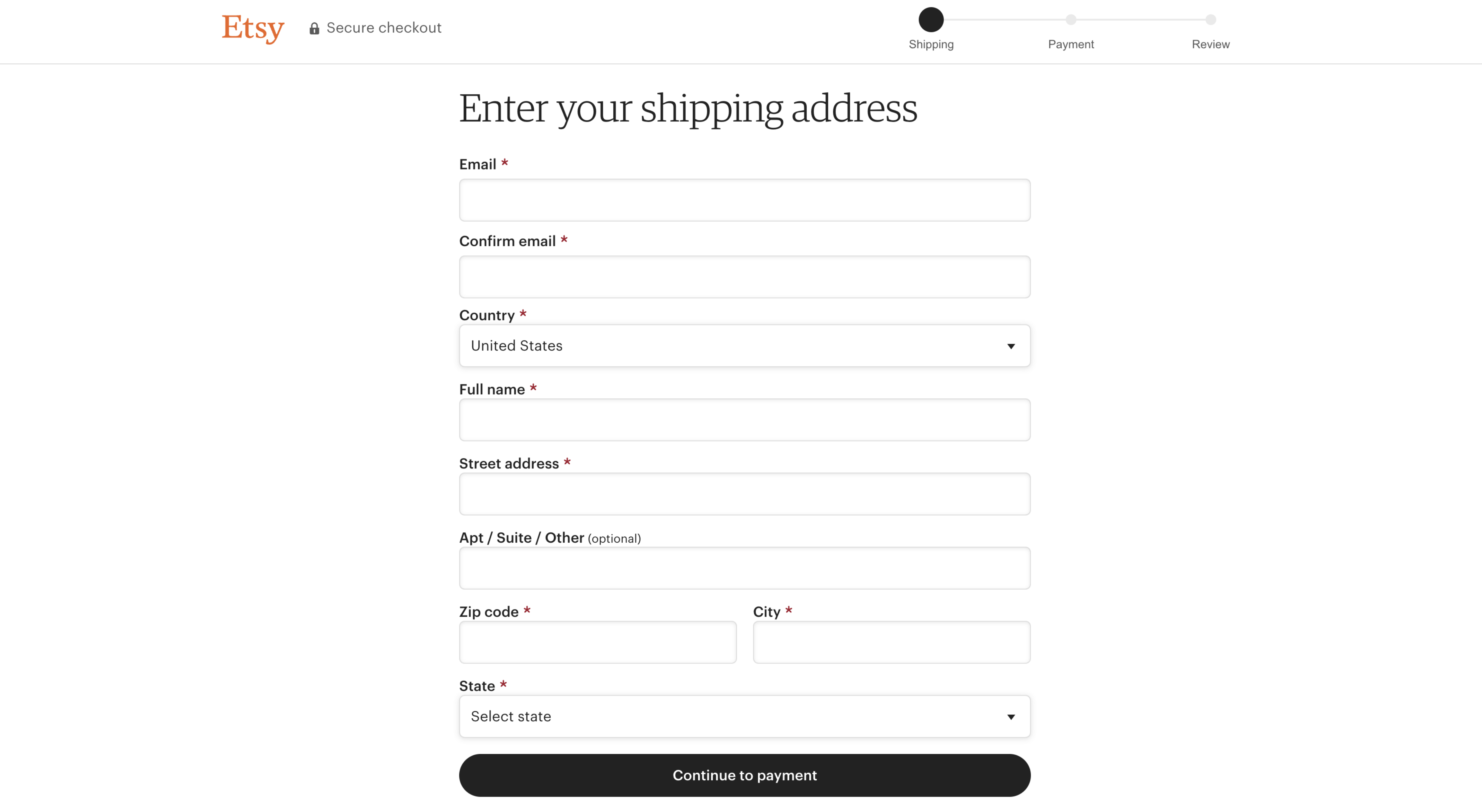
- Etsy Biggest Takeaway: Etsy’s payment page uses a straightforward three-step process with minimal images and clear input fields for easy data entry. By eliminating distractions, Etsy’s simple checkout page ensures customers can focus on entering their details without unnecessary clutter. The option to check out as a guest without creating an account also simplifies the process. Despite its minimalism, Etsy’s approach proves effective in facilitating smooth transactions.
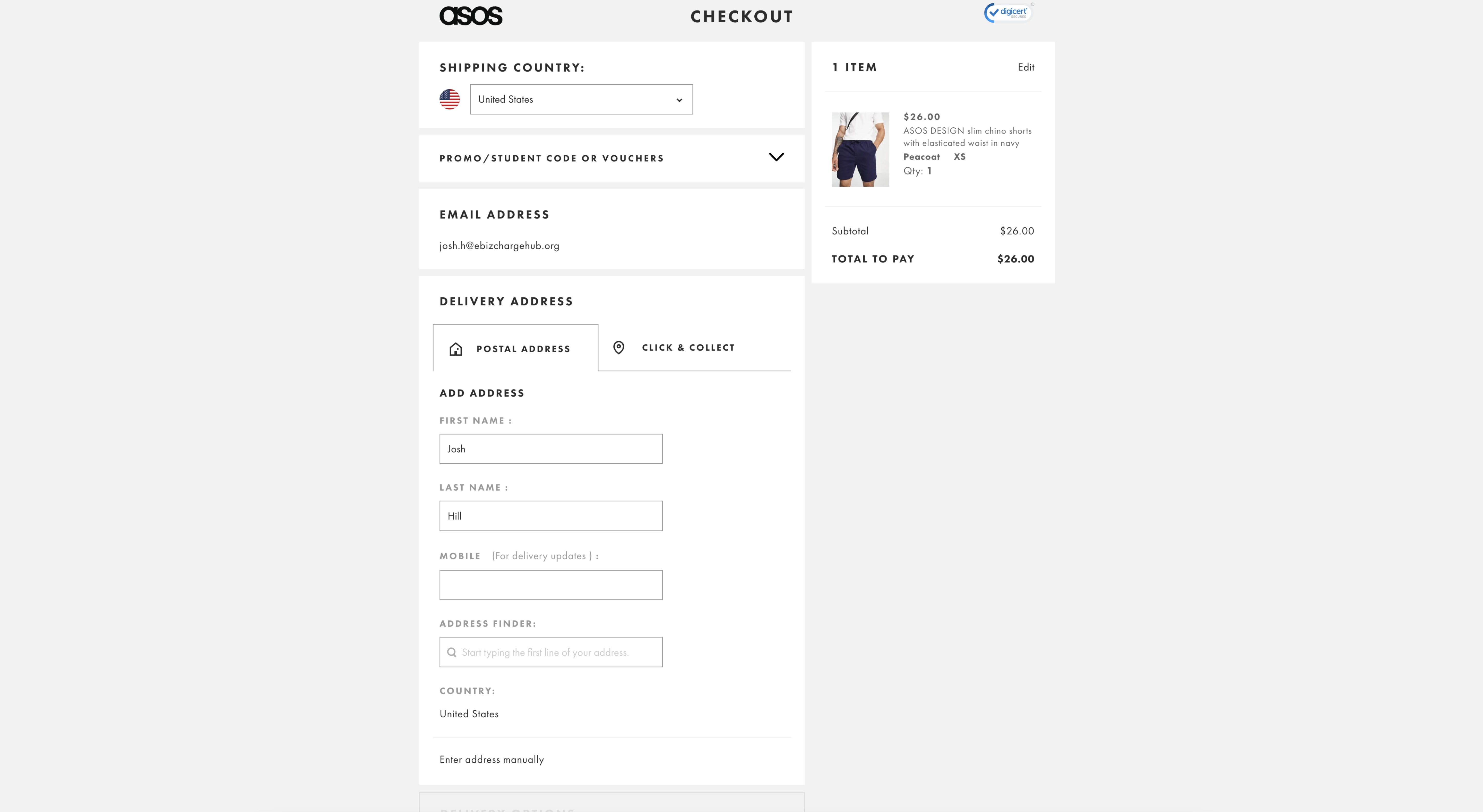
- ASOS Biggest Takeaway: ASOS employs a clean design with minimal color and a focus on essential fields, enhancing clarity and reducing distractions. ASOS’s payment page mirrors Etsy’s simplicity but includes a trust symbol to reassure customers about payment security. Although the page requires five steps to complete the transaction, which could be streamlined, the focus on essential information fields helps maintain user confidence and privacy.
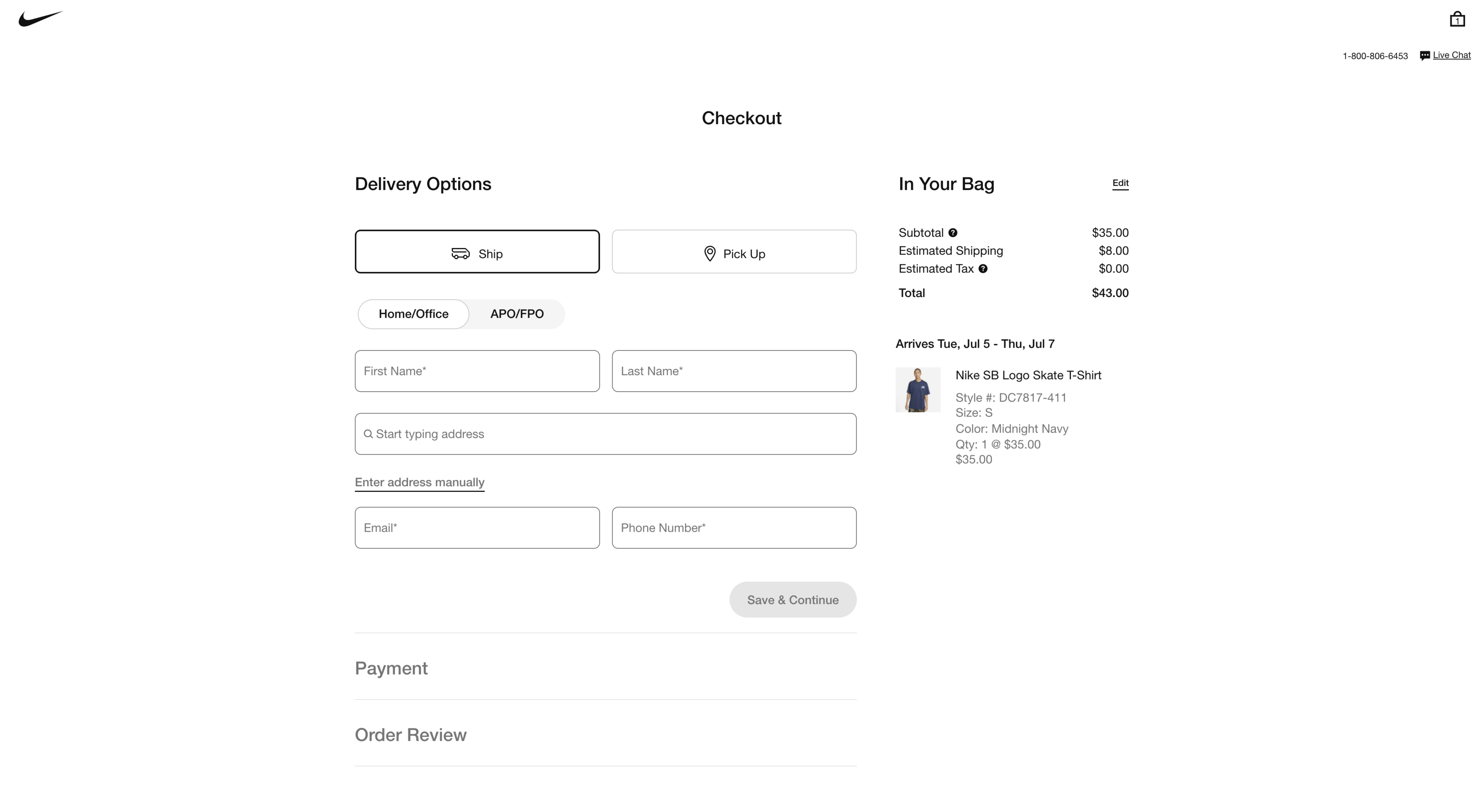
- Nike Biggest Takeaway: Nike’s checkout page stands out by displaying product images alongside customer details, allowing users to review their purchases before finalizing. The inclusion of product images on Nike’s payment page helps customers visualize their order, motivating them to complete the purchase. The three-step process is integrated into a single page, minimizing distractions and simplifying the checkout experience.
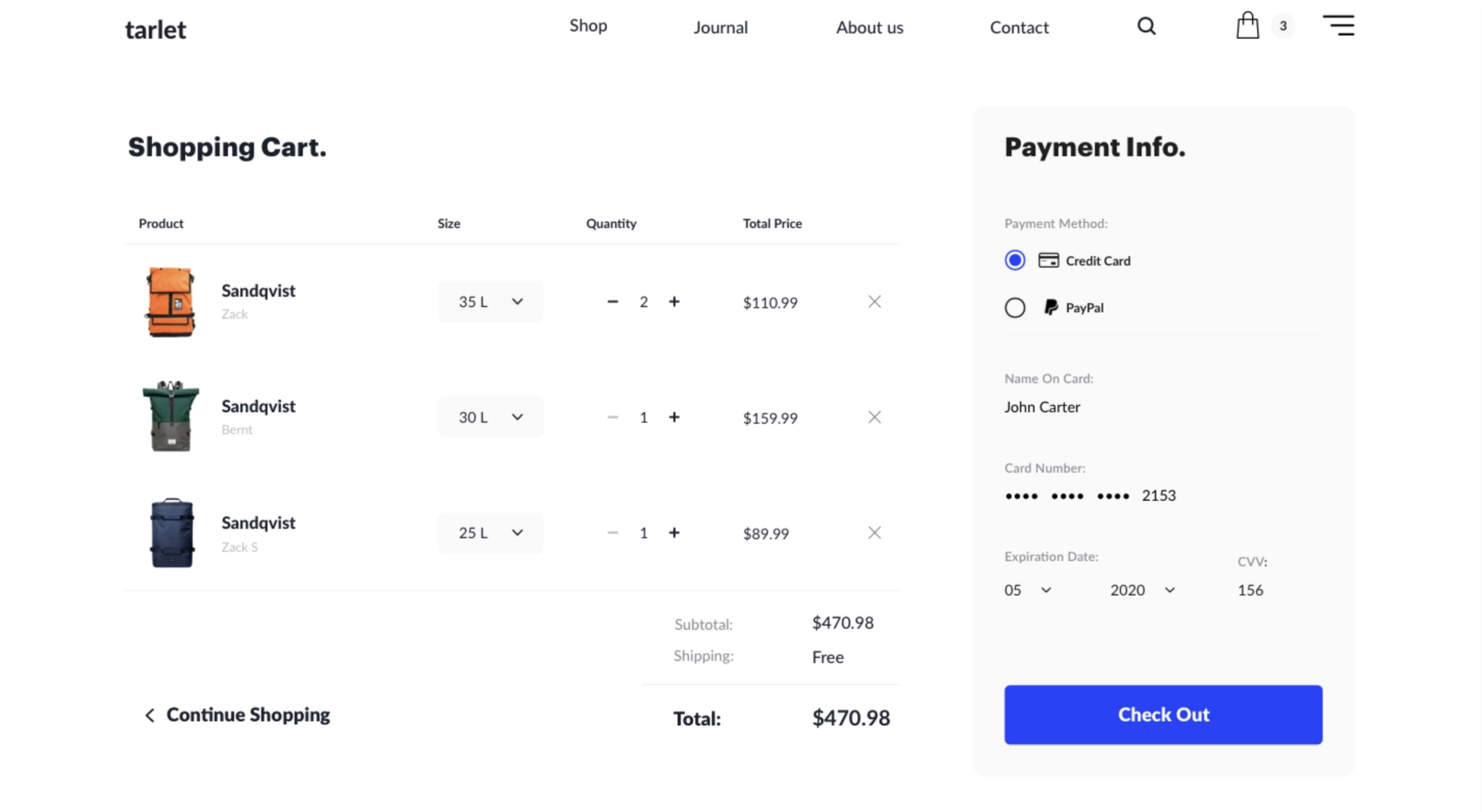
- Minimalist Page Idea by Eugene Lazarez Biggest Takeaway: This minimalist design features a prominent display of product photos, sizes, quantities, and prices, creating an engaging and focused checkout experience. Eugene Lazarez’s minimalist checkout page uses ample space and clear text fields to highlight product details and encourage purchase completion. The one-page layout simplifies the process, making it easy for customers to finalize their transactions.
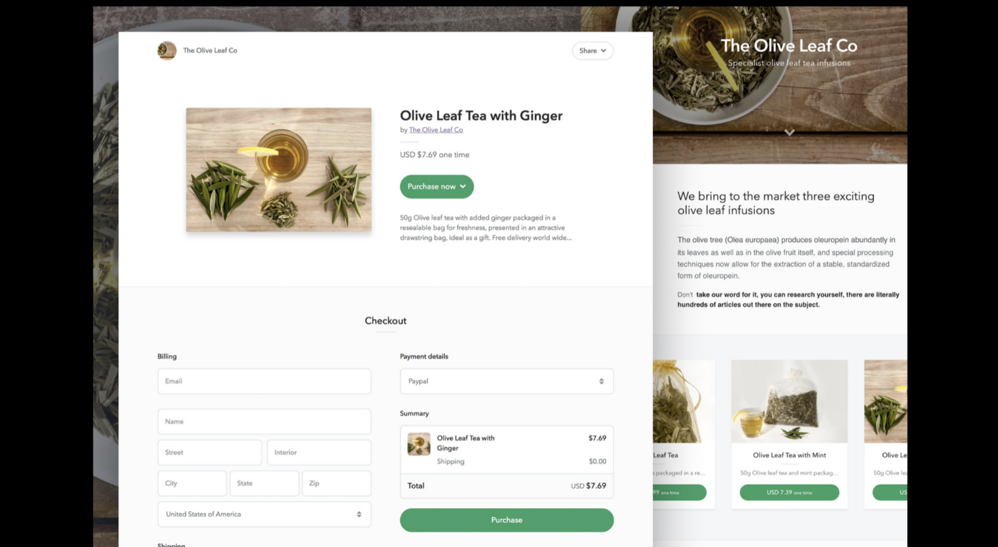
- One-Step Page Idea by Kasper Christensen Biggest Takeaway: This design condenses the payment process into a single page, showcasing product images and detailed descriptions, streamlining the purchase process. Kasper Christensen’s one-step checkout page integrates everything into one view, including a large product image and clear text fields. This design minimizes the steps required to complete a purchase, making it quicker and easier for customers to finalize their transactions.
Payment Page Tips
- Keep Promo Codes Subtle: While promo codes can attract customers, a prominent field for them might distract users and lead them to search for discounts elsewhere. A small dropdown for promo codes is often more effective and less intrusive.
- Offer Instant Payment Options: Including payment methods like Apple Pay, Google Pay, and Click to Pay can significantly speed up the transaction process. These options not only offer convenience but also enhance security.
Rmarketingminds
Explore Rmarketingminds to Design your websites with premium Designs